How can you get the color that you want?
You’re in the paint store looking at color samples. “Wow, this color looks great!” You get the paint and take it home, but once it’s on the wall it doesn’t look like you expected.
What happened?
We’ve seen a lot of people pick colors from a TV show or even a paint chip and be surprised by how it looks after painting.
Our guide should teach you everything you need to know about how paint colors work so that you don’t have any surprises. We try to keep it simple but the topics are very deep and range across many fields of study. So feel free to skip around to what interests you! Before we get into all of the factors that go into paint colors though, here is our foolproof method to pick the color that you have envisioned.
Daniels' Painting Simple Color Guide
Pick a range of similar paint colors to the one that you like
Buy samples of all of them in the exact paint type you will use
Apply 2 coats to the area you wish to paint
Choose the one you like the best, or go back to step 1.
Yep. The best advice we have after years of experience is to simply put the paint on and see.
That’s the simplest way!
If you are curious about paint, light, color, and how they all interact read our detailed post below. We explain how color is perceived by the eyes, how light travels around a room, and finally where light comes from.
The Ultimate Guide To the Perfect Paint Color
Table of Contents
Physiology/Psychology
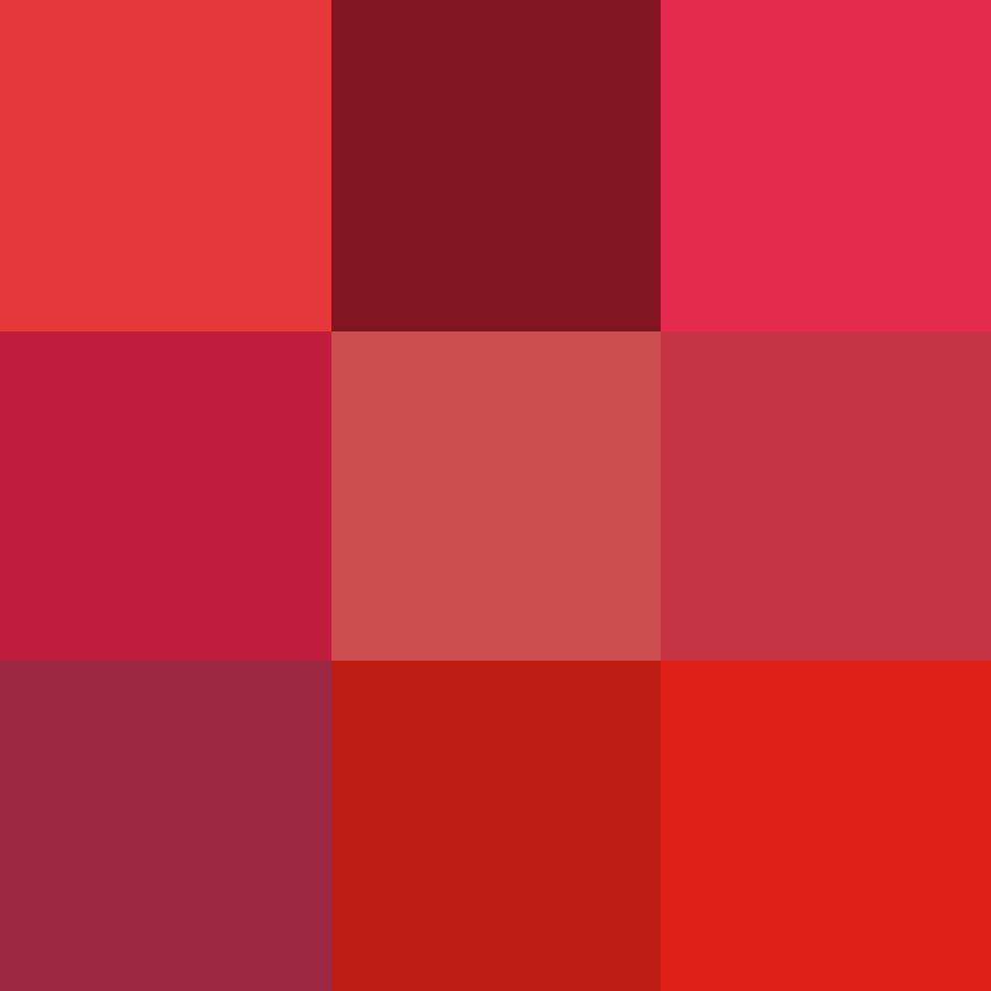
Simultaneous contrast
The 2 gray inner squares below are the same color but the backgrounds make them appear slightly different. In the same way, your furniture or garden can cause different walls to look different. Of course the reflection of green light off a tree or lawn onto a white house matters as well, but here we are referring to how an accent or trim color or front door can cause the body to “pop”.

Emotion
Different light temperatures and colors can have an impact on your mindset. There is a reason that colors can be described as “energetic” or “calming”- they literally are. What most people don’t know is that color perception works in reverse as well- angry people are more likely to interpret a blue-red image as red than calm people. So if the color doesn’t look quite right, consider taking a break and looking again later. This brings us into color theory for choosing a color.
Color Theory
We won’t go into depth here but different colors have different associations. Blue is refreshing, calm and relaxing. Red is passionate and commands attention and works great as a front door color. Yellow and Orange are fun, bright colors that cause feelings of warmth and summer. Green reminds us of wealth and health and growth. White is sterile and pure, and connotes feelings of cleanliness. Black is associated with mostly negative things and needs to be paired with another color to represent sophistication, luxury, and elegance.
Eye of the Beholder
No two people see color the exact same way. It’s not just all in our heads though- it’s also in our eyes.
First, the light hits your retinas and activates color sensing cone cells. Some people, mostly women, have 4 kinds of cones while most of us only have 3. This means that some people actually see more colors than the average person. Usually, though, women simply have a larger color vocabulary than men. That means they can see cherry, rose, garnet, scarlet, crimson and others while the average man sees red and really red. And of course some people are color blind. There are several types of color blindness and they mostly effect men.
Mechanics
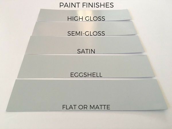
Sheen
The measure of reflectivity or luster. High Gloss is easier to keep clean but shows all imperfections and textures. Flat paints diffuse the light and cover problems extremely well. For exteriors most people choose satin and occasionally eggshell.
Flat paint is great for ceilings, reducing glare, or hiding something in plain sight since it deflects attention.
Satin is great for exterior walls as it looks new and shiny while covering up minor blemishes.
Semi-Gloss is great for bright interior trim and exterior doors but requires a lot of prep and sanding, and can cause glare.
Texture
The same exact paint on different surfaces will look different. We see this a lot with all-white exteriors as the wooden trim and metal gutters will look slightly different enough to still stand out from the siding. Keep in mind that paint chips are completely smooth and siding always has some texture. Bumps on the surface cast tiny shadows that darken the color.
Environment
We often see that green lawns, red maple trees, or blue pools can reflect their light onto a house and cause areas to look different. The sunny side of the house will also look different from the shady side.
Physics
Paint Composition
Paint mainly consists of 3 things: Pigments, binders to hold it together, and liquid for application. Pigments can be further divided into a base (usually a white color mainly composed of expensive titanium dioxide and cheap talc, clay, silica, etc.) and several tints- this is where the actual color comes from. When you order a paint, there is a sticker with a color code on it. This tells you exactly which tints were added and in what amounts. Depending on the color you chose, the base may also be different. Red and Yellow colors are very tricky and require a lot of tint, leaving less room in the can for the base and binders. This is why some colors don’t cover as well and require additional coats or even primer- we will discuss that elsewhere.
Light Sources
When things get very hot they make light. The hot thing can be the sun, a flame, a wire in an incandescent bulb, metal vapor in a street light, or even a tiny piece of magnesium-doped gallium nitride with Yttrium aluminium garnet-cerium and doped phosphor coatings (That’s what it takes to make a white LED!). Anyways the tiniest pieces of light that come out (photons) have a color already based on what hot thing emitted them.
Wavelengths
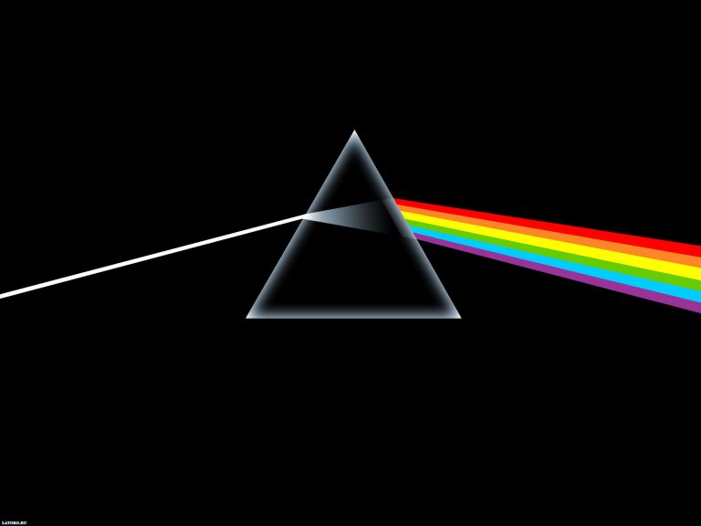
The color you start with influences the end result. You know that if you shine a red light on white wall, the wall looks red. That’s because the white paint can only reflect the red color. As you know from school or Pink Floyd, white light actually consists of many colors. Just as water drops can split sunlight into a rainbow, physicists can split apart the light from an LED or a street light or incandescent light bulb. This can be graphed to show the wavelengths that come from that light source. Different light sources emit different colors to begin with, so the same exact paint under different lighting will look radically different. If your light source is very blue, or doesn’t have much red light, your red wall accent wall will look very dull instead of vibrant.
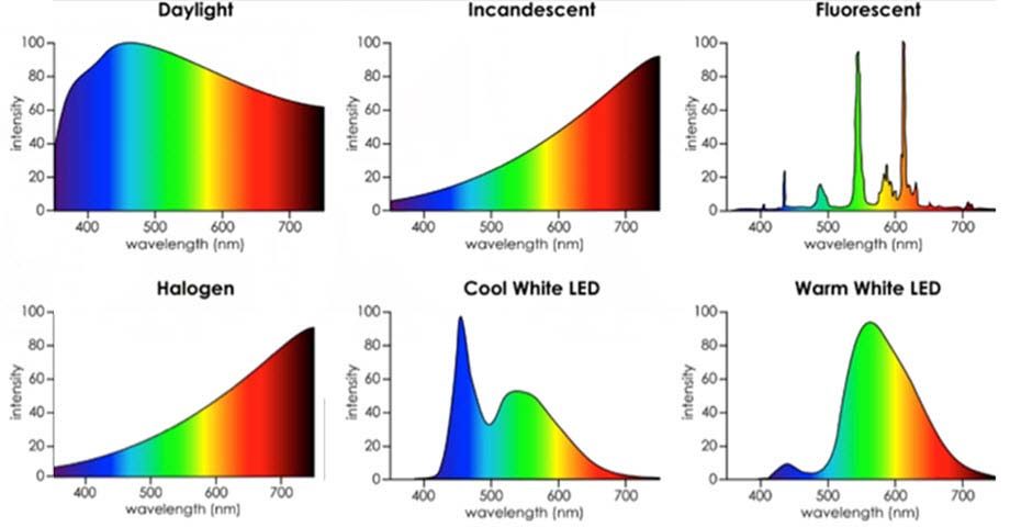
Color Rendering Index
If we compare how accurate an object looks under an artificial light source to daylight, we can calculate a number with 100 being perfect. A sodium street light has a CRI of -44 since it emits only a single 589 nm beam- that’s why everything looks the same gross color under those old lights. Play with the slider below to see how poor lighting can hide colors. Standard LEDs have a CRI of 83 while high quality ones can go as high as 99. Incandescent/halogen bulbs can score 100.
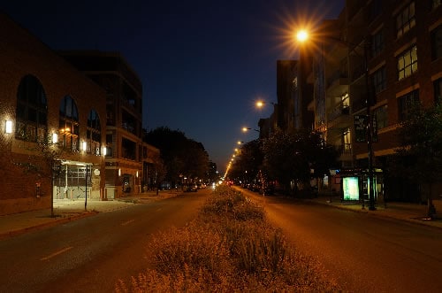
Color Temperature
This is a confusing one. This number can be thought of as the temperature in Kelvin of a star or piece of metal that would emit this kind of light. Kelvin temperature can be calculated as Celsius minus 273. So if you heated a knife up to 1273°C it would be glowing red-hot, and if you kept heating it, it would eventually glow white-hot, melt, and then glow blue-hot. We typically associate heat with reddish light because we never encounter the really hot objects needed to generate bluish light. This is different from color rendering index because all of the rainbow light from before is still there: there is just more blue light or red light. Thus there is a bias towards one end of the spectrum but the entire spectrum is present.
Color on Electronic Screens
Don’t use a computer monitor or phone screen to pick your final colors. You can get an idea of color using a screen, but you will need to compare physical color samples to see how they really look. Seriously, colors on screens are way too complicated for even this guide. Don’t trust ‘em.
Conclusion
For all the above reasons, we recommend that you test the paint you choose before ordering enough to paint the entire house. For most people painting their house is a big deal, and this is why we want to make sure that you are completely happy with the color before we start instead of having surprises later on.